The Persona's post from last week led to a really interesting conversation at work. I took a couple classes offered in the office and had some time for friendly banter with one of the user interaction designers. We talked about typography, design and oddly enough how the Personas exercise informs her daily work. The overall conversation was great and, besides making another friend, she is also interested in helping with the redesign project for the website. It's great to get a double win!
The First Draft
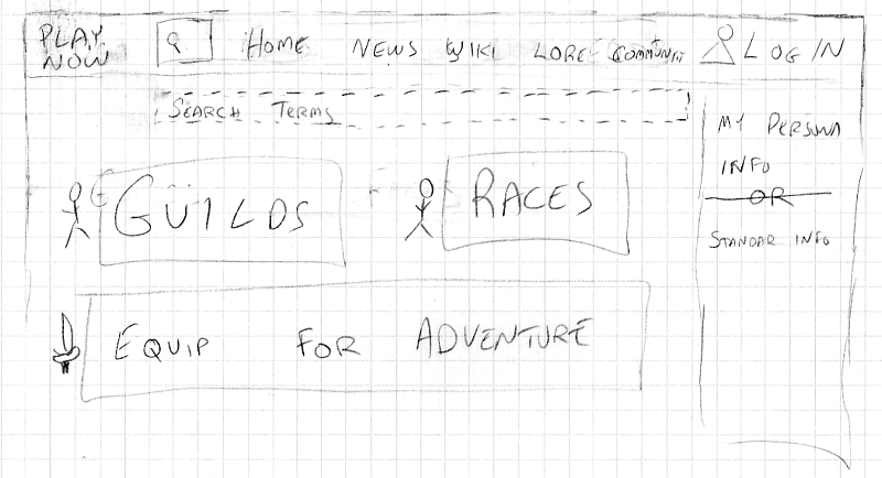
I created the first two drafts before we did the Personas exercise. The center viewing portal has a really simplistic look and emphasizes the main things a player might want to view. Navigation is featured along the top and, although it mostly works, there's no room up there to grow. It's hard to tell but the dotted line under the navigation bar is a highlighted drop down that would show up if you started typing in the search field. Solly pointed out that such a text-box would annoy users by covering up content or forcing elements to move. The right hand side content column looked good in my head but never materialized well on paper.
Take 2
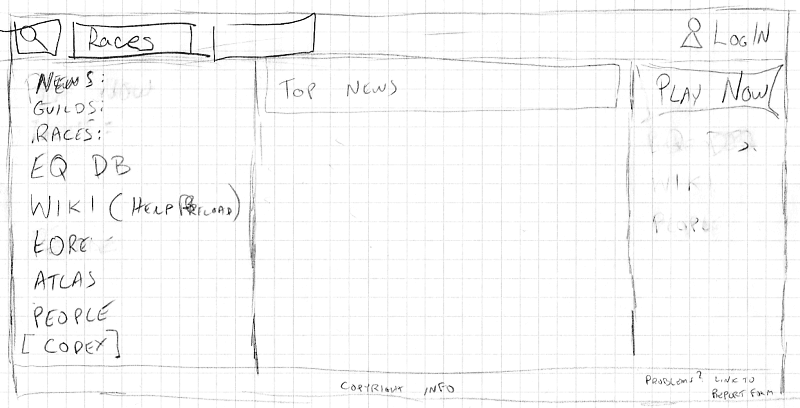
The second design was great until I finished it. I realized all I'd done was migrate the clutter from the first draft's top navigation bar to a left hand column and made an even more empty right hand column. The main needs of the player aren't really in focus at all with this design. The whole package just feels cluttered. The search motif was executed better here and that carried over to a later design.
A Bit Closer
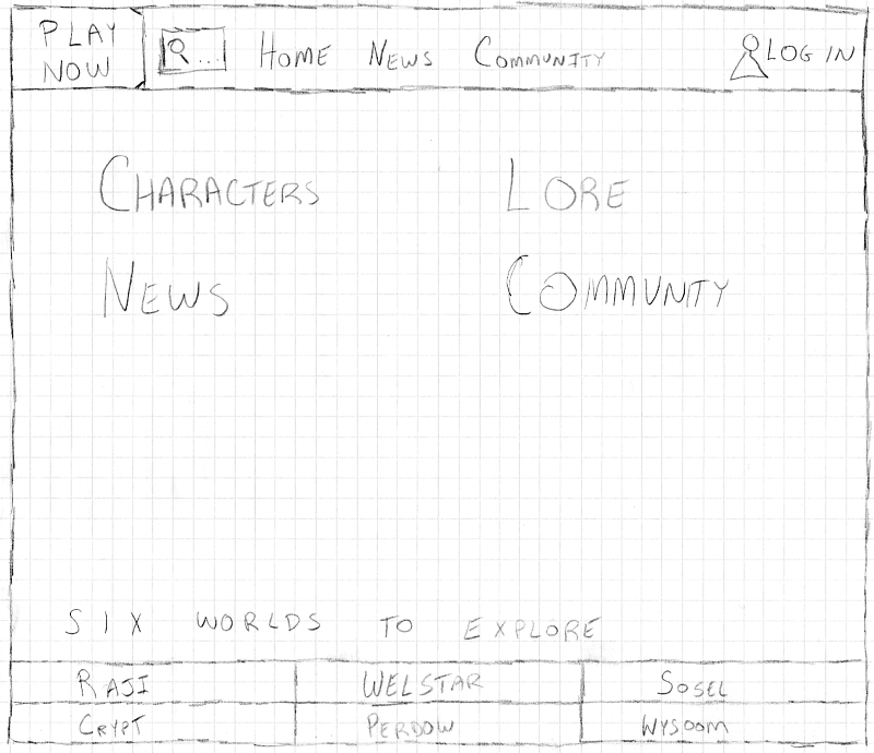
Our third sketch reduced the center viewing portal to just four panes. The simplified top navigation bar lost the full-line search element and that just didn't feel right. The duplicated news and community categories in the center viewing portal and top navigation bar were a lot better in theory than in practice. Would the viewer assume they were different? Is one of those news categories fake? Thankfully we'll never have to answer those questions because this design got scrapped. The six worlds to explore motif in the bottom navigation really stood out and joins the live search bar as a must-have element for whatever becomes the final product.
Ready to Prototype
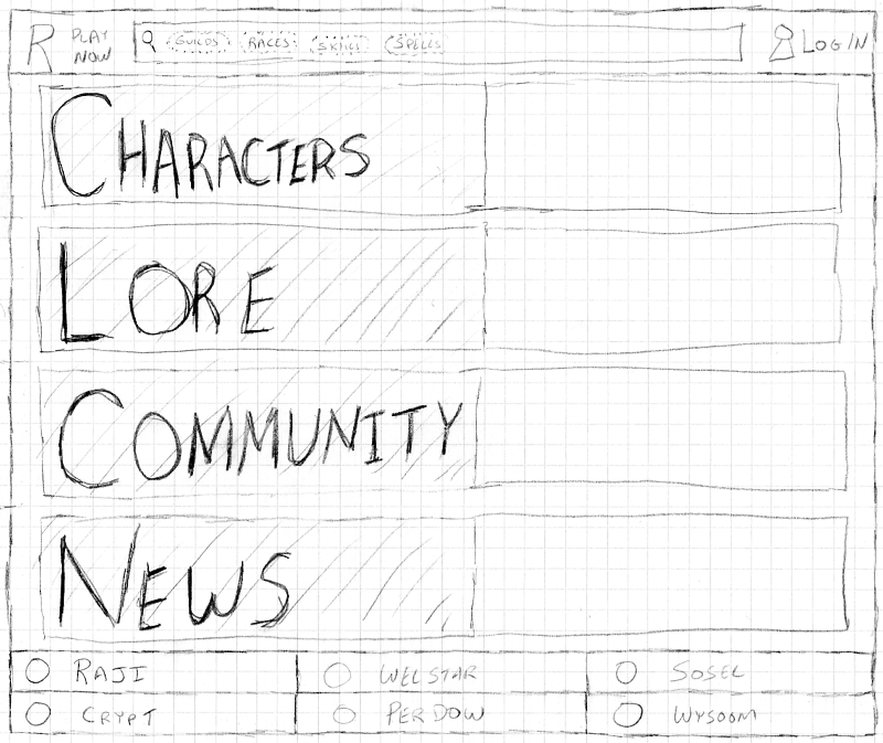
The Personas exercise focused our design. Players want to know about their characters, know about lore, engage with other players in the community, and get the latest news and updates. The latest design marries the best elements from the previous three sketches and really delivers on those needs.
The oversized text in the center viewing portal will be replaced later with some graphical design. The search bar at the top is the primary focus when the page loads. Start typing and results will pop up immediately; no more waiting or clicking around for fast answers. The six-worlds navigation bar at the bottom gives a nice close to the page and emphasizes the vastness of the Retroverse to new players.
Bonus points if you notice the design nod to game lore present in both of the six-worlds navigation bars.
Next Steps
The sketch may receive a few more revisions now that a user interaction designer has joined the fray. The prototype is underway, however, it's not quite ready for prime time. Do you find these sketches exciting? Hate the design and want us to start over? Send me your feedback and join the process.
Stay tuned for more updates!